 CAMPGROUNDER
Daylight is here. It's the colour of Dyneema.
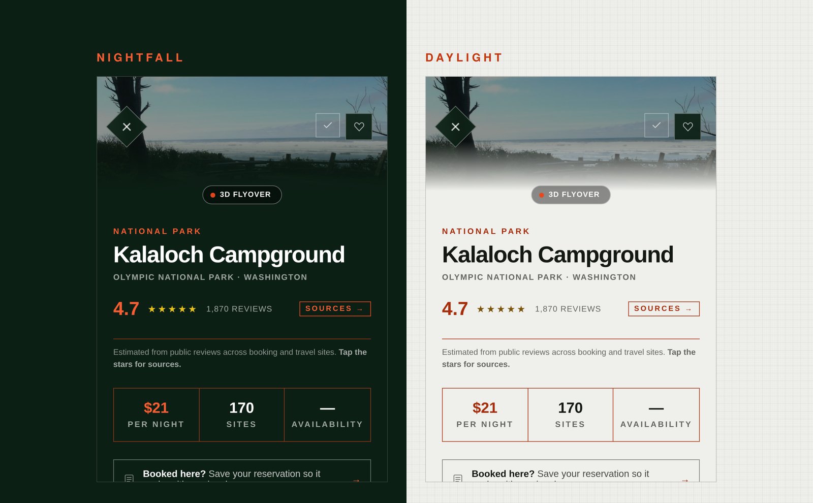
A week ago we wrote about Cairn, the design system underneath Campgrounder, and said the second set of colours was finished and close. Here it is. It's called Daylight, it's free, and Nightfall stays the default until you say otherwise.
Profile, then Appearance. Three choices: Auto, which follows your phone, Nightfall, and Daylight. Your pick stays on your device. There's nothing to sign up for.
What changes at camp
Most camping happens in the daytime, and a dark app in full sun is mostly a mirror of your own face. Daylight fixes something you've probably been working around without noticing: the tilt. Phone angled away from the sun, hand cupped over the screen, squinting at a fee you already half know.
Listings gain the most. A camp photo on an off-white page reads open where the dark version reads closed, closer to a print on a wall than a slide held up to a lamp. The amenity grid, the season strip and the site map all sit lighter on the page, so a listing scans in one pass instead of two.
And if your phone already goes light in the morning and dark at sunset, Auto just follows it. You never think about the setting again.
Why Dyneema
We didn't want a generic light mode. So rather than pick a white, we went and looked at a material.
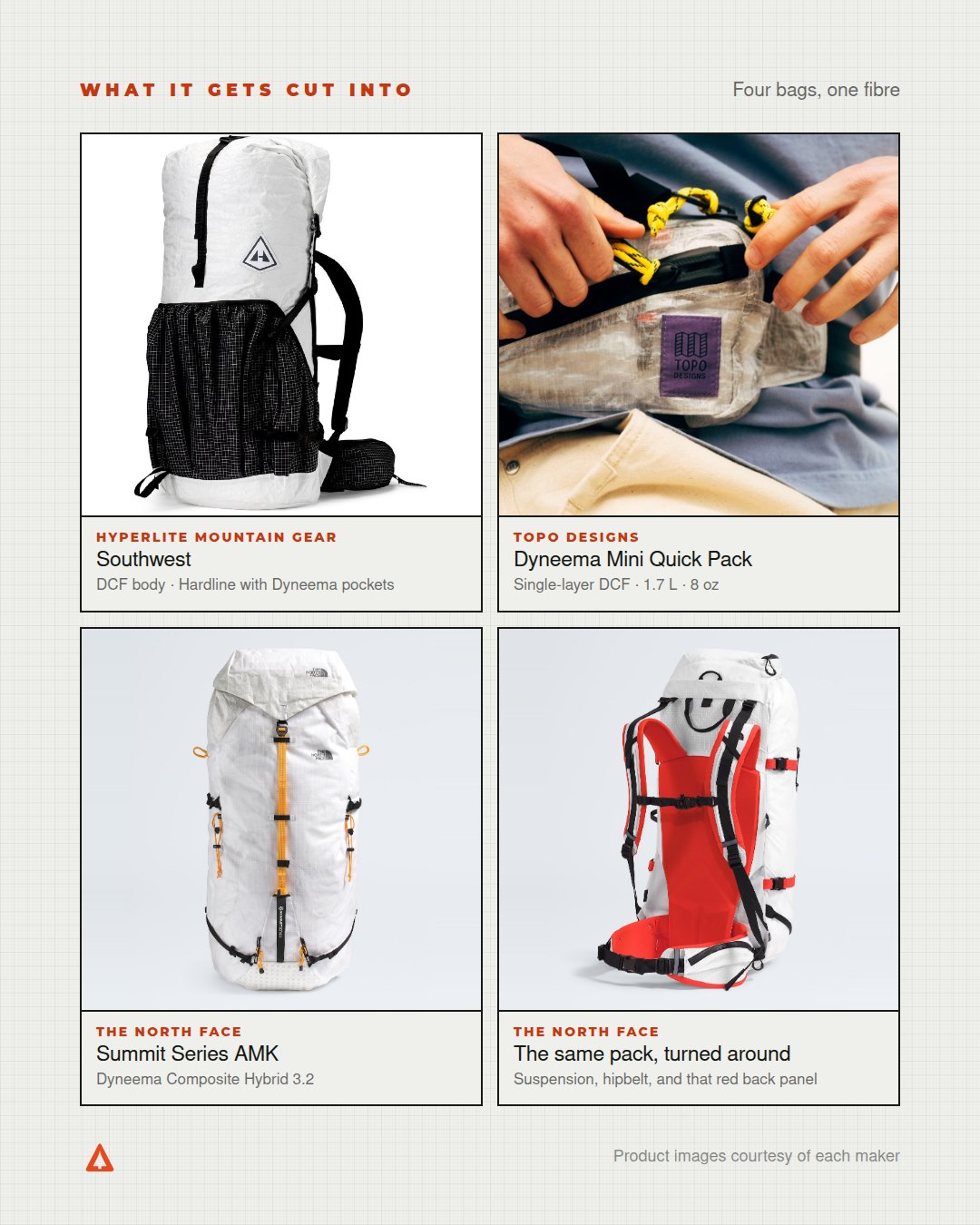
Dyneema composite fabric started life as Cuben Fiber, named for America3, the boat that won the 1992 America's Cup. It's ultra-high-molecular-weight polyethylene spun into fibre, laid out in a lattice, and pressed between two films of polyester. About fifteen times the strength of steel for the same weight, which is how a shelter cut from it packs down to nothing.
It looks the way it does because nothing is hiding the fibres. You can see the grid. That's the whole idea behind the theme, and it's why a faint weave sits under the panels in Daylight: a surface that shows you how it's built.
We took the long way
There's a cheap way to build a light theme: invert the dark one. Flip the lightness, ship it, let the browser sort out the rest. It takes an afternoon, and it goes wrong in exactly the places that carry information.
So nothing here is inverted. Every colour in the app was drawn again for the light ground, one at a time. The weather glyphs. The air quality scale. The connectivity bars, the sun arc on a forecast, every ring that shows you where you are on a keyboard. A yellow that reads as sunshine on deep green disappears on off-white, so on Daylight it becomes a darker brass. Not the same colour dimmed. A different value doing the same job.
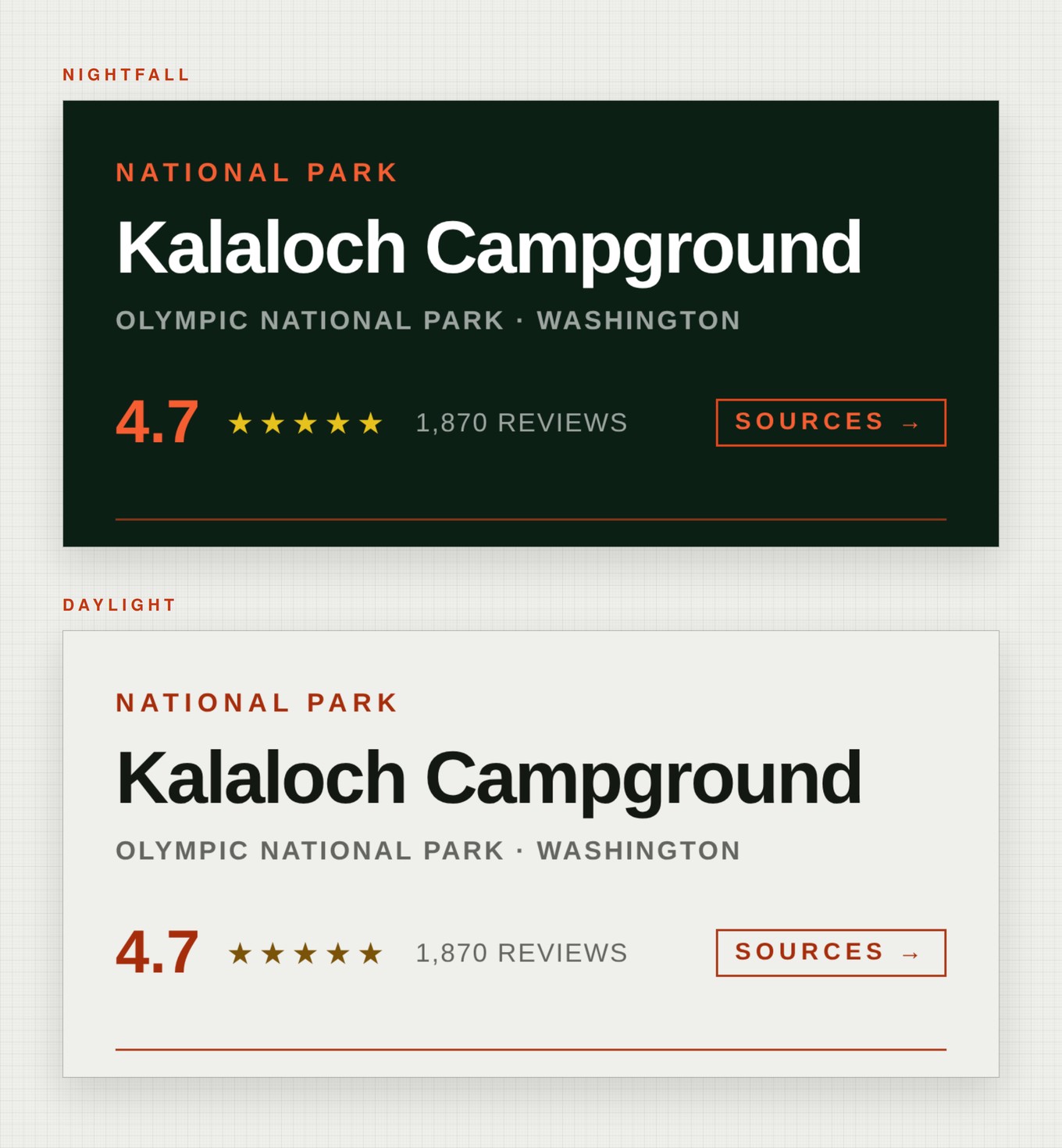
Campfire orange is the one value that never moves. The logo is the same #E8481C in both themes, because a mark that shifts with its background isn't a mark. Everything around it had to move. That orange sings on deep green and goes weak on off-white, so small tracked-out labels got a deeper one drawn for them, and accents inside a sentence went deeper still.
Then we read every screen in the app, in both themes, and fixed anything that came back hard to read. Some of it had been hard to read in the dark theme since launch, including an air quality label so faint against its panel you'd have had to hunt for it. That got fixed too. Which is the argument for actually looking, rather than squinting once and calling it fine.
It's free because it has to be. Anything that changes whether the app can be read belongs to everybody. Daylight isn't an upgrade, it's a setting.
Text and interface colour in Campgrounder is held to the WCAG 2.1 AA standard in both themes. Dyneema composite fabric was developed as Cuben Fiber and is a registered brand, owned by Avient since 2022. Product photographs on the last figure are courtesy of Hyperlite Mountain Gear, Topo Designs and The North Face. Campgrounder is independently owned and operated.